
I’m surprised that there wasn’t a major revolt last week. After going back and looking what I had done on that ill-fated Saturday night – and what I’d written about it – I was pretty unhappy. That’s why I titled it “Shuffling Maps Around.” It comes from a business term – well, more a bureaucratic term – for the act of looking busy without actually producing anything. Shuffling papers around. It’s a classic way for bureaucracies to avoid producing anything that would make them accountable and for office workers to look like they are doing something whenever the boss walks in without actually having to work. Moreover, it’s a classic procrastination trap: “I’ll get started just as soon as I get organized.”
Now, I stand by everything I said. I’m going to start by laying out a very small number of rooms in a very general way. Each of those rooms has to stand on its own as an encounter space. I’m going to use transparency effects to turn all of my design so far into underlays on which to lay out basic room designs. I’m going to work in sketchbook fashion, adding detail as I go. And I’m going to stick with the general rule that room sizes should run: Small (6 squares by 6 squares or 36 squares of area), Medium (8 squares by 8 squares or 64 total squares of area), Large (10 squares by 10 squares or 100 total squares of area), and Huge (12 squares by 12 squares or 144 total squares of area).
But I’m making two changes to what I did last week. First, there is no more vodka, Kahlua, or any other spirit involved. That was a bad idea. Second, I erased the room layouts I hastily came up with, and I decided to start again.
One last note before I close down this preamble document and get to work: I’ve divvied up the stuff I already designed into two different broad classifications. All the stuff regarding the critical path, days, encounter areas, exits, objectives? That stuff is classified as Scenario. The caves and canals and built up areas? That stuff is classified as Geographic Features. What I’m working on now are Rooms. I doubt I’ll use those terms, but if you see them in some of my screen captures or otherwise mention them, you’ll know what I mean.
Okay. Preamble over. Cup of coffee in hand. Map ready to go. Back in a few hours.
Large Scale Room-Design
And I’m back. And I feel like I made actual progress I’m actually happy with. Let’s get started.
First, as I said, I started by deleting pretty much everything I did last week and reset myself back to square one. I even reorganized the sheets and stuff to make it a little easier to work with. And once I was happy with the underlays, I focused my attention on figuring out the basic room designs for Day 1. Here’s the new and improved template for Day 1:
As I said, the first thing I like to do is establish a general size for each encounter space I’m working on. Most of my spaces are Medium, obviously, with a few Large and Small and a very small number of Huge rooms. The important thing to note is that these are just general sizes. They aren’t meant to be exact. My dungeon will NOT be made up of nothing but 6 by 6, 8 by 8, 10 by 10, and 12 by 12 squares. Obviously.
Now, I don’t want to work just one room at a time. That would take forever. I eventually want to be able to design multiple rooms at once. So, I figure the best thing to do is decide which rooms NEED to be a specific size, which rooms SHOULD be a specific size, and then just pick out the other sizes accordingly.
What do I mean by rooms that NEED to be a certain size and rooms that SHOULD be a certain size? Well, take, for example, the rubble-choked warren. That room is where the boss fight of Day 1 occurs. That’s where the PCs are going to face the brunt of the kobold warband. Now, kobolds are maneuverable foes that appear in large numbers. Well, as large as numbers can get at first level anyway. So, there will be a lot of them, and they need to move. That room NEEDS plenty of space.
Meanwhile, the three rooms that make up the entrance – the Gateway Concourse, the Grand Causeway, and the Seal of Oran Ionath – those are all thematically important rooms. They should establish this site as a fantastic and expansive space. All three of those rooms SHOULD be big. It doesn’t matter what will happen in there. They are going to be Large. Now, I could make them Huge, but Huge rooms should be very rare. I don’t want too many rooms that are so big that encounters turn boring in there. Beyond that, I know myself. As I tweak, my rooms tend to get bigger, not smaller, but they also tend to get a little more cramped. That’s just how I am.
The rest of the rooms can be Medium easily enough. But I decided to make the Windswept Overlook small. I was thinking about making the Orb Grottoes small. But I keep it medium because I’m going to need some space to do what I want to do with it. But that’s not something I’m doing today.
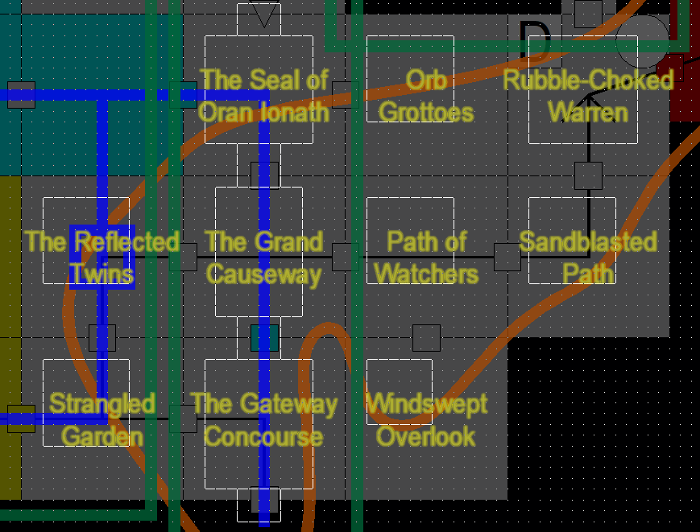
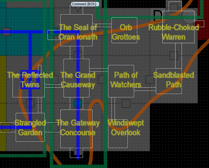
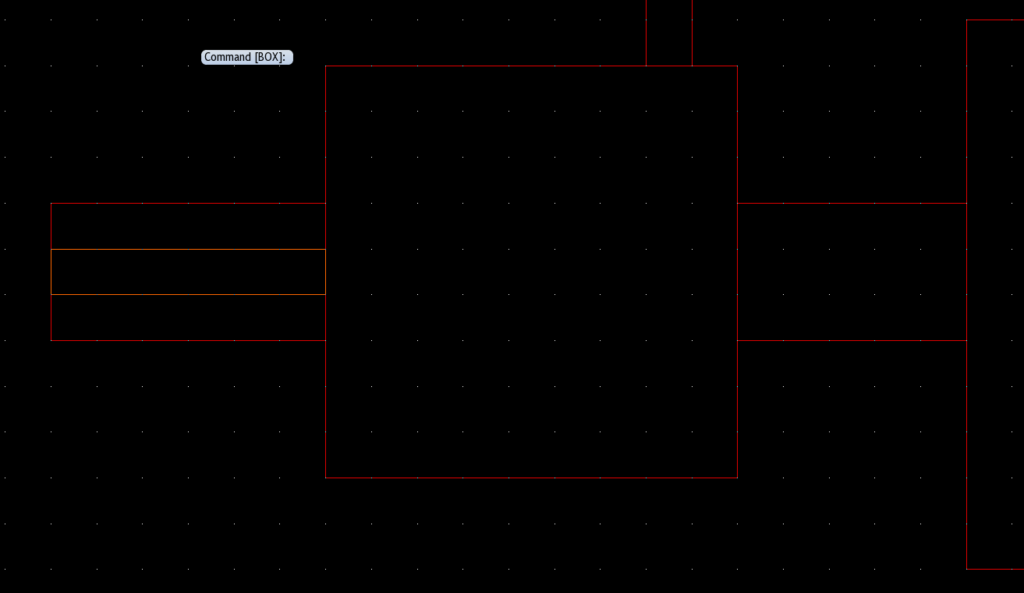
At this stage, I’m just trying to get a general sense of the space. So I just drop a box of the appropriate size inside each encounter area to give me a starting point for designing it.
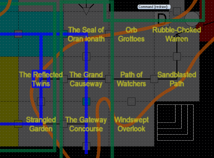
Once I’ve got the basic sizes done with, I want to figure out how the rooms are connected. Because the Grand Causeway forms the spine for this section of the dungeon, I start there. The Causeway is essentially a hallway between the Seal and the Gateway. I could do something like this:
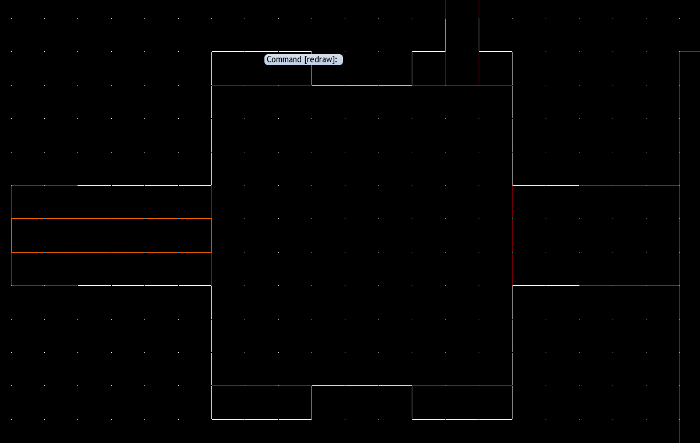
… but that causes a problem. Remember that one of the keys to making navigation easy for the players is firm delineations between hallways and rooms? Well, that falls apart if I make a room into a hallway. I mean, the room is still going to be a hallway. But it’ll be a chamber, like a great hall, not just a connecting hallway. I take the Causeway outline and lengthen and narrow it so that it’s an 8 square by 12 square rectangle and then I put wide hallways connecting it to its neighbors. For symmetry, I also add wide exits north and south representing the entrance to the dungeon and the great doors that lead into the sanctuary beyond. The locked, barred, and now massive-and-too-heavy-to-force doors.
The reason I make the passages particularly wide is that I need them to be wide enough to include a canal down the middle. Or two canals, running parallel along either side of the passage. I like that idea. With little footbridges leading off.
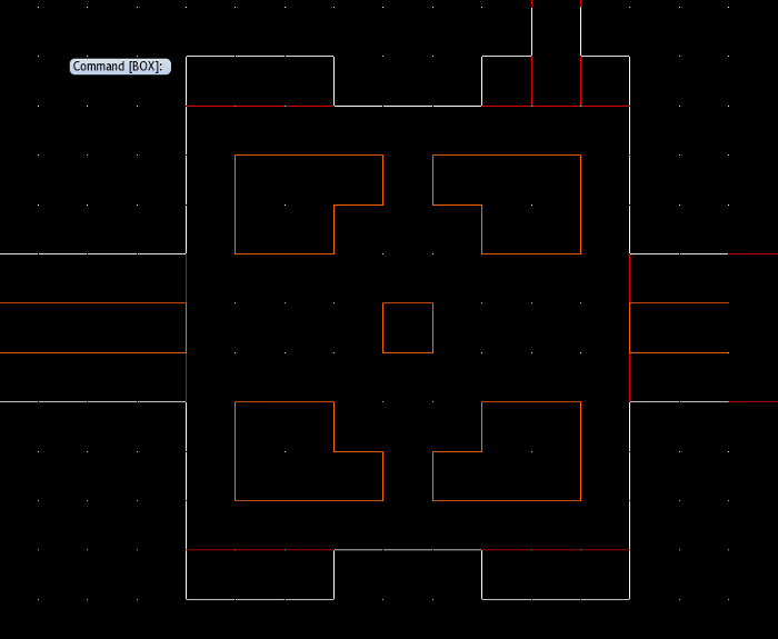
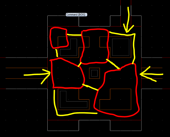
Now, we can hang the other rooms off the spine created by the Grand Causeway. I’ll show the picture first and then explain why I did it like I did.
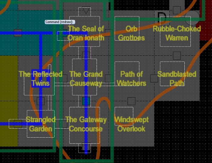
First, I moved the Strangled Garden’s outline closer to the Gateway and centered it a bit. Now, I need to account for a passage that is overgrown and toxic. Originally, I had toyed with the idea of just having these passages shrouded in poison. But, as I think about it, I like the idea of them being choked with toxic growth from the plant brain. I don’t want the players doing too many clever things to protect themselves from poison and pushing into the rest of the dungeon too soon. So, I envision the underground equivalent of one of those broad avenues with trees running down the middle. Obviously, this area will have to be open to the sky. Once, bare earth was left exposed down the middle of this hallway – remember, this part of the dungeon is artificial construction – and plants and trees were allowed to grow down the center of the hallway. But when the plant brain appeared and spread its toxic roots through the dungeon, they not only grew up into the garden and strangled it, they also choked the passage and blocked it off. Once the plant brain is dead, these roots will recede or rot away through the magic of… well… magic.
So, I make a wide passage that leads out the Strangled Garden and mirror it in a path that connects to the Gateway Concourse.
Then, I move the room for the Reflected Twins closer to its neighbors. Since the room is built around a reflecting pool or two, it should also have an elongated feel to it. So, I have the Strangled Garden passage come into it off center. I also center the passage from the Reflected Twins to the Grand Causeway to match the aesthetic of a reflecting pool hall. And then I add a hallway to nowhere directly across from the Strangled Garden hallway.
The hallway to nowhere is a fantastic trick for maps of ruined sites. In this case, it’s a hallway that has been caved-in and buried. There’s no going any further. It’s a dead end these days. But a hallway to nowhere – despite going nowhere – actually plays an important psychological role. Basically, it covers a lot of plot holes. It says, “this site used to be bigger, there was other stuff here too, but you can only get at part of it.” Used liberally, they allow the party to theorize that anything that seems to be “missing” from the site, like housing and bathrooms and stuff, must have been in those ruined areas. Likewise, they also explain away oddities in navigation. “Why did the locals design this place, so you could only get from the shrine to the garden by getting past three locked doors and solving two puzzles?” Well, obviously, there WAS an easier way. But it ran through those hallways to nowhere.
I will be adding a few hallways to nowhere throughout this project to keep players brains from looking too hard at the design of the dungeon.
You might also notice that I am ignoring the canal that I planned to run through these two rooms. Yep. I don’t need it. The reflecting pool in the Twins room can have some sort of aqueduct feeding it through the north wall. And the Strangled Garden doesn’t need a substantial pool if it’s going to be open to the sky. We can assume that rainwater kept it mostly alive and elven water bearers cultivated it during dry spells.
Now, I’m ready to move on to the eastern half of this section of the dungeon. Let’s take a look:
Initially, I placed the passage from the Grand Causeway to the Path of Watchers directly across the Reflected Twins hallway. For symmetry. But I realized that symmetry was actually a bad idea. The Path of Watchers – in my mind – is a winding passage with carved speleothems watching over it. And the Grand Causeway is a passage through a natural cave. Symmetry is bad. So, I move the passage connecting the two up into the corner of the Path. The exits are both in the bottom. So, with the terrain in the room, we can create an S-shaped path that winds back and forth through the space.
I elongate the Windswept Overlook a little because I want a terrace that looks out of the side of the mountain into which the dungeon is carved. So, it’s got to project a little. The passages from the Sandblasted Path and the Orb Grottoes are also offset from center to purposely avoid symmetry.
The Rubble-Choked Warren is another improved natural cave with “buildings” built into the northern and eastern walls and major doors. The northern door, because it also opens into the Sanctuary and represents a major gate is nice and wide, a mirror to the gate in the Seal. The eastern passage is smaller, but still substantial, for the locked door that will lead into the garden.
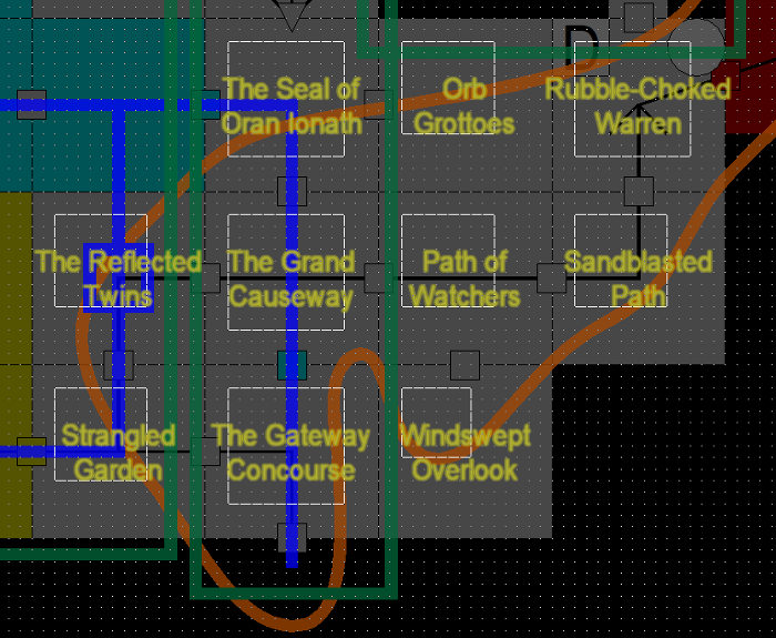
With the general sizes and shapes of the rooms and the connections between them laid out – and that process took about 30 minutes, which means the whole dungeon could be planned to this degree in about two days of work – I’m ready to begin the next step: designing individual rooms.
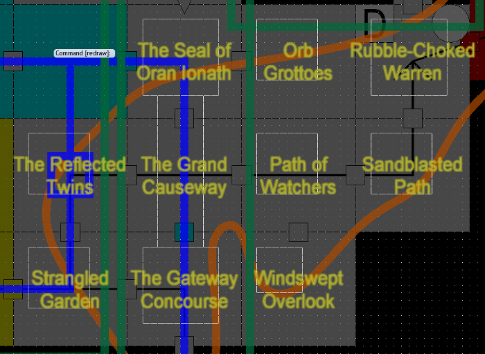
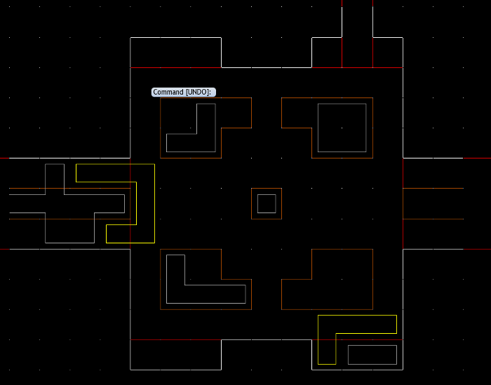
Because I’m just going to work directly with wireframe rooms I’ve designed, I’m going to turn off all of the other design underlays. I can always turn them on again to check on things, but I pretty much remember the important features. That leaves me with a white wireframe that looks something like this:
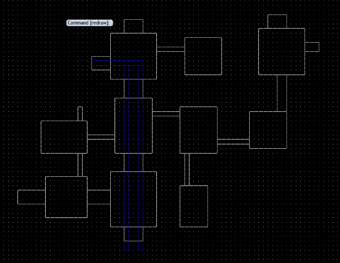
Now, the grid guide that I’m using is 5 feet to one square. So, we’re working on the D&D tactical scale. And the one feature I do decide to drop right onto my wireframe is the canals that run along the main causeway. Then, I turn the white lines red. Why? Because the white stands out very well and I want to use that for the actual wall sketches. Basically, each time I have a sketch I like and want to use as guidelines, I tend to mute the colors and drop it down below the layer I’m working on. You can imagine the whole thing as a series of transparent overlays or like a bunch of sheets of tracing paper.
And, with that, I’m ready to design a room.
Carving Out a Room
As we design each room – and we’re not fully, artfully mapping each room here, we’re just laying out the terrain that will actually affect the game – and we’re not even designing mechanical effects yet, we’re just leaving space for those mechanical effects to hook onto – as we design each room, our eye is toward doing two things: bringing the name of the room to life with prominent design elements and creating a space that would make for an interesting combat encounter if one happened. Basically, this sort of a way of visually exploring mechanical and thematic ideas.
See, normally, you’d figure out all of your mechanics first – what’s going to live in the room, how do different obstacles work, and so on – and then draw a map around those elements. But, when creating a site-based adventure, the map IS the adventure. So, I like to work from the map up into the mechanics rather than down into the map from the mechanics. The space is so important to the adventure that I really want it to serve as a foundation for everything in the adventure.
Let’s pick a room to work on. The Strangled Garden is a good room to start with. It’s evocative, I’ve got a good basic idea in my head of what it is, and it isn’t too complicated a space. So, focusing on it:
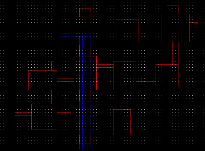
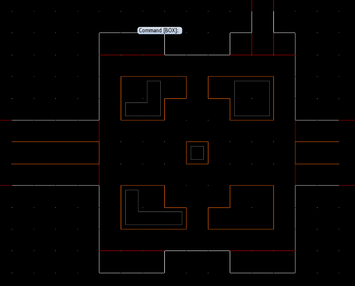
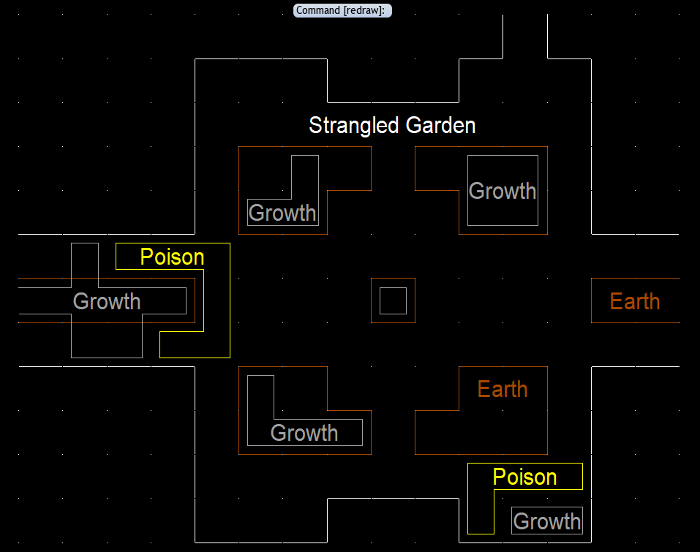
Right off the bat, I draw in a brown rectangle to represent the open, bare earth garden that runs down the middle of the passage to the west. Of course, the rest of that passage will have to wait until I’m designing that section of the dungeon, but I want to lay the groundwork.
The Strangled Garden was once an open, artificial space – like a cloistered courtyard – that took advantage of an open cleft or chimney through which the sky was visible. The space would be squarish, but instead of making it a perfect square, I make it a little oblong. And I add recessed spaces in the walls. People can walk through the middle of the space on their way through the sanctuary, or they can retreat into the alcove spaces to sit on benches and meditate or relax. You can see by looking at the white walls compared to the red lines underneath that all I’ve really done is add a few projections off the room’s basic rectangle. And that’s generally how I build artificial spaces. I just lump together boxes and rectangular shapes.
Now, this is a cloistered garden courtyard. Generally, there would be an open space in the middle that contained the actual garden and a walkway around the perimeter. And that might work, but for the fact that this garden is choked and strangled and dead. The roots of the plant brain have grown up and sapped the rotting husks of dead, skeletal trees of the last of their nutrients. That’s why it’s strangled and desiccated. See? Power of words. I like the idea that the remains of the plants – gnarled wooden stumps and shrubs – have turned gray and hardened into stone like a petrified garden. The plant brain has leached out the vital essence of this place. That means that whatever plant husks remain are basically obstacles. This isn’t underbrush you can just tromp through. Instead, they are low barriers. The equivalent of chest-high walls that you can see partially through with a taller, bare tree-trunk here and there.
That means the idea of a garden with a walkway around the perimeter would make a terrible space for an encounter. It’d be a square hallway with dead space in the middle. Instead, I decided to create four corner gardens with a broad path down the middle. That emphasizes the idea of traffic passing through the middle of the space and visitors relaxing in alcoves hidden behind the gardens. I lay out where the paved floor of the room gives way to bare earth gardens in brown.
Now, that’s still a LOT of dead space if it’s all overgrown. But I can actually assume that most of the plants here were herbaceous plants – flowers and ferns and crap like that – and didn’t survive the downfall. Only tough, wooden plants survived long enough to be strangled and petrified. So, I outline a few squares in gray that contain petrified growth and assume the rest of the bare earth is open terrain. It won’t even slow movement.
Now, I admit I played around with the shapes a little bit before I finally had the right mix of features. And it’s hard to explain exactly why I settled on the shapes I did. But I can illustrate the idea by highlighting something. Check this out:
By placing the petrified growth where I did, I effectively subdivided the encounter space into four zones – four smaller battlefields – interconnected by chokepoints. There’s three entry points into the room. The first time the players visit, they will enter the largest zone in the lower-right. Enemies might be scattered throughout the other zones. With the petrified growth providing amble cover and concealment opportunities, it’ll be hard for the players to hide out in the doorway and just blast the room. At least, at low levels. And even if they do, the doorway is so wide that one character can’t effectively hold the doorway AND provide cover for everyone behind him.
If the players are drawn into the space, there are chokepoints to hold and corridors to use to maneuver around checkpoints. This is a great space for a combat between groups of melee combatants. And a strategic party can surround a single creature or pair of creatures by using the space.
Whenever I plan an encounter space, I like to use the terrain to create some kind of interesting dynamic. And often, the easiest way to do that is to just use it to subdivide the space and to provide numerous avenues for engagement. It’ll work particularly well here for the kobolds – yes, that’s at the back of my mind – because they are numerous foes who like to gang up. The heroes can use the chokepoints to avoid being ganged-up upon, but if they try to hide in the doorway, the kobolds CAN gang up on them at least three kobolds to one meat shield.
But there’s another thematic element that needs to be incorporated into this space. The plant brain’s poison has to be fully on display, and the western passage has to be choked off. While I love the idea of clouds of poison as terrain features, gasses are a pain in the a$&. Simple spells like gust of wind can move them around, as can air currents. With this room open to sky, weather SHOULD affect clouds of gas.
As a general rule, I don’t like to put anything on the map that is too mercurial or ephemeral. This dungeon is going to require some changes the map already – and we’re going to have to decide how to present those at some point – and I don’t want to add to that.
So, rather than creating a cloud effect, I’d rather have an effect tied to a semi-permanent part of the map. So, the plant brain’s blooms spew clouds of poison, continuously – that’s still a gas – but the posion disperses quickly so it’s only a danger if you’re adjacent to the plants. Or, more specifically – because we do want to think about how these mechanics will work – if you start your turn adjacent to the plants OR move into a square adjacent to the plant. That’s a pretty standard way in D&D 5E to handle aura-type effects.
So, we can choke off the western passage with plants and then have poison spread from the plants. But we don’t JUST want to give the idea that the plants are there to block passages. Otherwise, they seem like artificial doors instead of features of the dungeon. So, we can also have some of the plant brain’s roots break through the southeastern corner of the room in the largest zone – the one the PCs will be fighting in. That’s nicely out of the way. The PCs don’t have to get close to it. But it’s there. And we will probably add plant brain blooms to other areas as well, even where they aren’t blocking passages.
So, I add some more growth and then highlight the adjacent squares that are filled with poison in yellow.
But, whoops, look what I did. If you look at where the poison is, you’ll see it actually isolates the western “zone” of the encounter. You can’t move into the northwestern zone or into the corridor that runs along the southern wall into the southeastern zone. Not without going through some poison. That’s okay. Hazardous terrain is perfectly fine. But, considering the PCs are going to be coming in from the southeast, that makes stuff harder on the kobolds – or anyone else who might be defending this room. The PCs will have a maneuverability advantage.
Unless the kobolds – the ones who serve the green dragon – are immune or resistant to poison and move through those zones with impunity. It makes sense, from a story perspective. And it would make it easier for the kobolds to navigate the dungeon. With their small size and poison immunity, they can ignore the plant-choked toxic passages. So, if the PCs question how the kobolds can move around this space, well, there’s an answer.
Moreover, it means this combat space is actually THREE different types of combat. When the PCs enter, if they encounter kobolds, the kobolds have a slight maneuverability advantage. Later, when they return and encounter a random encounter, that foe has a maneuverability disadvantage. Unless the foe is undead. Which is a distinct possibility. Later still, after they have killed the plant brain, when they fight a random encounter in here, it’ll be more even because the poison will be gone. It’s a small difference, but a difference nonetheless. And it shows off how dynamic the dungeon will be.
This is actually VERY important for this room. This room is the second room in the dungeon. And until the PCs change the water flow, they will be traveling through this room on EVERY visit. Every time they get stopped by a random encounter in this room and depending on the state of the dungeon, the combat will have a slightly different feel to it.
Overall, I’m pretty happy with the Strangled Garden. Happy enough that I won’t be erasing it and redesigning it.
The last thing I do is label the room and the features so that, later, when I have to draw a beautiful, artful map over it, I don’t forget what all the features are.
And with that room designed – and with 4,000 solid words about how I did it – that seems like a good place to stop for this week. Next week, we’ll add some more rooms. Eventually, we’ll be cranking out ten or twelve rooms at a quick pop. And that’s good. Because we have, like, 314 rooms to go.
Well, we’re getting there…
Man, this article is a fine lesson on room desing. It’s cool to see that you think first about the functionality of a feature, while never forgetting the themes that you’ve established before.
If we have a continuation of the “building an adventure with Angry” sickie this week, this week be the best week for adventuring design ever: not just for this site, mind you, but for the hobby as a whole.
Thanks again for making Mondays fun!
Love the advice on the hallway to nowhere; I’m used to them being openly mocked with any groups I play with, but that’s largely part of having been using random generators for so long (a practice that I’ve been regretting more with every article from this series and Build and Adventure) and some of the bizzare layouts they can create. Corridors that bisected dungeons were unusually common and got the most ridicule.
I like the implied checklist you’ve outlined here for the room design. Theme of the room based on the title, what does it need to tell the players about the dungeon’s history, what does it need to tell the players about the dungeon’s present state, how is the inital planned encounter going to play out, how will the encounter space change as the party progresses, how will the initial and changing layouts affect future random encounters. The first three points lead the room’s structure and what elements are present, the planned encounter determines how they’re laid out, and the last two points highlight that the party is having an effect.
The loss of the poison making encounters in this space harder is interesting, although given that they’ll have several extra levels before seeing that, they should be fine. I get the feeling some of my players would start to plan around forcing enemies into the poison, and would need to adapt.
Gererators are best used to get a writing implement into your hand when facing a blank page; you gotta start somewhere and generators make that bit easy.
True dat. Once a generated map is in front of me, it quickly changes to look almost nothing like it did to start with but that seed is invaluable to get the creative juices flowing.
While this is a slight roll back of the last two paragraphs of the immediately prior article, I am glad for it. The thoughtful approach and inspired method for building things keeps on making me feel like the DM equivalent of a toddler. I can walk a bit, but wow is there are lot more to it.
I am very curious how Angry will approach actually running the game. My *guess* is creating 315 pre-made maps to pull out and place down as the adventurers go through and then back through rooms. If they are evolving and changing and he wants to remind them of features inside the rooms, actually providing the pre-made maps would be necessary. I expect that I will be surprised when he eventually addresses it.
Running it digitally on a large flat-screen or tablet at the table would make sense as well. Even though maps and figures are optional in 5e, I fully expect that a map-is-the-dungeon style that we see here will require a constant visible focus in order to keep key elements in front of the players’ eyes.
I’ve wondered about this too. It really seems like it would work best if the players could actually see proper print outs of the rooms as they progressed through the dungeon, rather than quick sketches whenever combat breaks out.
Angry actually talks about this waaaay back in the early days of the series. You use evocative naming not just to help you remember the rooms, but to help your players remember the rooms. The name informs what are the defining features, and you encourage your players to physically map the room as it goes.
Remember, they’ll find the corpse of an explorer with a rudimentary map started, showing them how to start the mapping process. It’s also the reason for the Room -> Hallway -> Room transitions. Each room has to basically stand on its own in terms of being memorable.
So, you run the game with your words and descriptions only, until you need to bust out a map for combat. Or at least, that’s how I’d do it.
If Angry actually makes this whole thing into digital art, I would absolutely buy that and import it into roll20 to either run for people online, or project it on a wall for people in person.
Ahh, I have forgotten.
And digital art – yes! It doesn’t have to be beautiful, just functional. Most of my roll20 maps are nothing more than my own line art. I find the overly detailed maps too chaotic and players keep asking about random things in the room rather than the things that i put into the room.
Hypothetically, Angry should sell the map packet for money.
I’m really curious to see some of your finished rooms when they end up happening. I tried using, or copying, or really outright stealing this dungeon philosophy for a smaller dungeon I was making a while back and found the size limitations to be surprisingly difficult to work with. Even looking to many of the dungeons I’ve loved in the past, I had just a nightmarish time trying to find interesting rooms that even fit in the 15 by 15, let alone the 12 by 12.
Part of that is that the shape of the room is one element of the design, not the sum total of what makes the room interesting. They’re the canvas you paint, not the whole picture. You can make two identical rooms into wildly different experiences just by tweaking the furnishings and atmosphere: a burned-out 30’x50′ great hall full of smashed furniture makes for a Gears-of-War-esque battle from cover; a 30’x50′ gallery with a water feature that constantly billows out fog will lend itself to a whole sneaky-sneaky fog-of-war kind of action.
The other thing is that fifteen squares to a side – 75’x75′ – is actually really big. It sounds like a small number when you just say it, but go outside and pace that shit out. For perspective: It’s nearly as long as a basketball court, and significantly wider. Most fire codes would let you seat almost 800 people in a theater that large.
It’s both big, and small.
It’s big if there’s two of you playing tag, or you want to quietly seat 800 people. Sure.
It’s not so big if you’ve got a bunch of big muscular guys in armour swinging polearms wildly around their heads (since you mention basketball: when you play, does the court ever seem “roomy” to you?). It’s small if one of you is firing an arrow at the other instead; practically point-blank range. Very small if you’re trying to run across it as fast as you can (maybe three seconds at full sprint for most people). *Tiny* when you reflect that an adventuring “day” is about 10-15 such areas – a whole day to explore across an area smaller than a football pitch… albeit that it’s cautious underground exploration punctuated by life-or-death battles, rather than a casual stroll across an open field.
But that’s a problem with D&D and RPGs / wargames in general, not Angry’s Megadungeon. Scale is… problematic.
I’ve never tried swinging a polearm around, but a standard boxing ring is 20×20 feet, so you could comfortably fit nine boxing matches into a 75×75 room without anyone feeling cramped or running into their neighbors. Weapons give you more reach, so we’ll tack on ten feet and say you need 30×30 feet to have a comfortable swordfight. That’s still small enough that you could fit four swordfights into a basketball court without running out of room.
My guess is that basketball players tend to move around a lot more, since they don’t have to worry about getting stabbed. Also, the action tends to be restricted to the area around the basket, with half the court going unused at any given time.
In D&D, nobody makes a flat-out sprint in combat (a “run” action). A typical combat move is 30 feet in 3 seconds, which is somewhere between a jog and a brisk walk, something you can plausibly do without lowering your weapon. And once you’re actually in melee, you’re basically stuck at 5 feet per round unless you want to provoke. People move a *lot* slower when they need to keep their guard up.
15×15? Are you talking feet or squares? Because that’s not one of his sizes in either measure. The smallest room is 6×6 or 30ft x 30ft, and the largest is 12×12 or 60ft x 60ft. Are you saying that want enough room? Or too much?
I think he’s referring to the 75×75 space that Angry allocated for each room to be in on the full map. The actual rooms are smaller to acount for wall sahpe and hallways and the like.
My .02 cents: How about adding some water canals or a pool? That would allow the room to be transformed yet again, and it makes sense even if it’s in the open.